Blackletter typefaces elicit many contradictory emotions depending, of course, on the context in which they are used and the manner in which they are composed. Sometimes they bark commands – STOP or BEWARE. Other times they are comforting in an ecclesiastical way – Christmas and Easter greetings. During World War II Blackletter was menacing for those in occupied lands who read it as exclusionary – as in FORBIDDEN or DANGER; others accepted it as patriotic – in Germany, it was volk (or people’s) lettering. Some Blackletter alphabets are difficult to read; others are simple, depending on how they appear on a page (and who the reader is). Some designs are ornate (a few) with elegant flourishes; others are oppressively gothic, dark and dogmatic. Had it not been for the Roman letter inscription on Trajan’s Column, we might all be using Blackletter variations today.

I appreciate the inherent ambiguity. Letters are designed to express multiple feelings and expressions. Blackletter faces will be interpreted quite differently – good and bad – but these are letters that cannot be ignored. Which is why I like OTC Textura; it has many potential applications with so many media. In all caps and upper- and lowercase, the characters are readable, not only as display type (which is the intention) but also at 11 or more points; it works well as a text face too. Although it only comes in one bold weight, it has a few alternative letters, like three different capital “A”s and two lowercase “e”s, as well as a pleasing “ff” ligature that allows the designer an opportunity to play. And let’s not ignore the two versions of Cap “F”. The sharp brushstroke letters echo typical Blackletters, but the way designer Andrei Ogradă plays with the bottom of the caps “M” and “N” gives the static letters a sense of movement.

Despite the decided eccentricity of this typeface (e.g., the lowercase “V” and “W”), it is nonetheless very geometrically drawn. When letters come together, they form fluid patterns that are curiously soothing to the eye. Although Blackletter is not my preferred type style, OTC Textura Regular proves that sometimes a typeface that is associated with one feeling or emotion can be designed to overcome the perception.
| Font of the Month: OTC Textura | |
|---|---|
| Designer: Andrei Ogradă | Foundry: Ograda Type Co. |
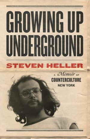
 Steven Heller is nothing short of a legend in the design community. Award-winning graphic designer, author and editor of hundreds of books (yes, 100s!) and one of the world’s foremost authorities on graphic design history; and arguably its best design commentator. Follow Steven on the must-read The Daily Heller and read his latest book, Growing Up Underground: A Memoir of Counterculture New York.