Without screwing up the space/time continuum, if I could go back in time, let’s say 45 years ago when I edited, art directed and designed underground tabloid magazine-newspapers, and I could take back a contemporary font family to use as the exclusive typeface for one of those periodicals, I would choose Ritualist designed by Justin Penner in 2024. With 18 different styles and 9 weight options, Ritualist would be well suited as the sole fonts for, just coincidentally, a publication I once conceived but never realized, titled Ritual.

Planned as a monthly, each newsprint issue would have contained confessional stories about totems and the like, aimed at a readership of clinically diagnosed and casually obsessive compulsives (a demographic that arguably includes most of us – especially among type designers). It is an audience who today fill the vast social media universe with countless quirks, eccentricities and superstitions. Keeping with the OCD spirit, the format would not be anarchic – assembled willy-nilly with variegated typefaces and letterforms – but nonetheless, owing to the grand diversity of unique rituals, the graphic design would have necessitated a certain level of flux. In other words, it needed to have a rational typographic frame in which a broad range of compulsive behaviors would be featured.

Hence, when I was introduced to Penner’s Ritualist, my brain went ping. Not only did I recall a happy memory of a fun idea, but I immediately developed a deep fondness for the typeface apart from any other emotional considerations. Ritualist has a strong personality and works effectively in caps and upper- and lowercase, roman and italic, and in weights ranging from black to thin (and every measure in between). It is neither serif nor sans serif but provides an illusion of both. None of the characters are perfectly proportioned (that is to say, there are few straight lines), but separately and together (as all caps, all lowercase and upper- and lowercase), they are perfection (a ritualist’s dream).

As bold caps, Ritualist is somewhat reminiscent of vintage Plakatstil block letters. Yet do not mistake this for nostalgia. There is nothing bygone about it. In Ritualist’s other weights (and in combinations of them), it is decidedly contemporaneous. It is also a great name for a type family in these uncertain times when rituals serve as mental anchors.
| Font of the Month: Ritualist | |
|---|---|
| Designer: Justin Penner | Foundry: Delve Fonts |
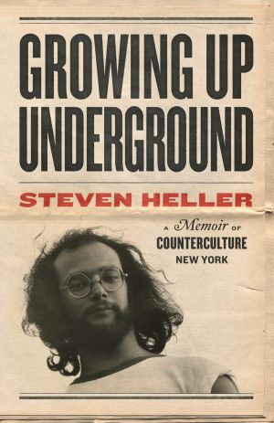
 Steven Heller is nothing short of a legend in the design community. Award-winning graphic designer, author and editor of hundreds of books (yes, 100s!) and one of the world’s foremost authorities on graphic design history; and arguably its best design commentator. Follow Steven on the must-read The Daily Heller and read his latest book, Growing Up Underground: A Memoir of Counterculture New York.