“Doublethink,” one of the eerie dystopian terms coined by George Orwell in his cautionary novel, “Nineteen Eighty-Four,” is defined as believing in two contradictory viewpoints simultaneously. In Orwell, Big Brother’s mind-control principal is rooted in the doublethink slogan: “War Is Peace; Freedom Is Slavery; Ignorance Is Strength”.

As a critical reminder that “doublethink” (like Orwell’s other famous coinage, “newspeak”) has linguistic and political currency now, Barnbrook Fonts developed a font called Doublethink inspired by an inventive lettering style drawn during the 1960s by Vinko Ožić-Pajić as an outdoor logo for Standard Konfekcija, the Yugoslavian state-owned clothing stores that became the premier fashion brand outlet. In addition to this exotic typeface, Standard Konfekcija was known for being the first retail business in the country to offer plastic bags.
Standard Konfekcija ceased to exist after the fall of Communism, but the lettering, like some other Soviet-era Latin alphabets, did not suffer the same fate. The original was reinterpreted and expanded in 2005 by Jonathan Barnbrook and Marcus Leis Allion and re-released in 2018. It is offered in two weights—Doublethink Medium and Doublethink Bold Inline.

Both include capitals and lowercase, as well as quirky options for some letters, such as the lowercase “I” with and without a dot. Every aspect of this tubular design is ingenious. Although it is not a script in the strict sense that the letters are not attached to each other, the fluidity of the spaghetti-like line, especially the Medium, gives the impression of writing. The Bold Inline is a little too fussy, and I found it harder to play with (sadly, they did not include an unadorned bold). However, the medium has a versatile array of caps and lowercase, notably its “d”s and “t”s. The uppercase “A”, which looks similar to a hip-paperclip, is supplemented by an odd-looking, but nonetheless playful, lowercase “a”.
The original Standard Konfekcija typography may, for some, evoke an Eastern Bloc aesthetic, but I see it as ultra-contemporary. Intended or not, Doublethink is a ready-made template for global logos. Just about every letter is ripe for use as an identity mark. So, if you’re looking for one, I suggest considering the upper and lower case “E” and “W”. Whatever the political rationale for reviving this relic, Doublethink does not have the stigma that its title implies.
| Font of the Month: Doublethink | |
|---|---|
| Designers: Jonathan Barnbrook & Marcus Leis Allion | Foundry: Barnbrook Fonts |
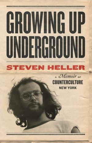
 Steven Heller is nothing short of a legend in the design community. Award-winning graphic designer, author and editor of hundreds of books (yes, 100s!) and one of the world’s foremost authorities on graphic design history; and arguably its best design commentator. Follow Steven on the must-read The Daily Heller and read his latest book, Growing Up Underground: A Memoir of Counterculture New York.