St. Catherine, bad feet, & the first italic
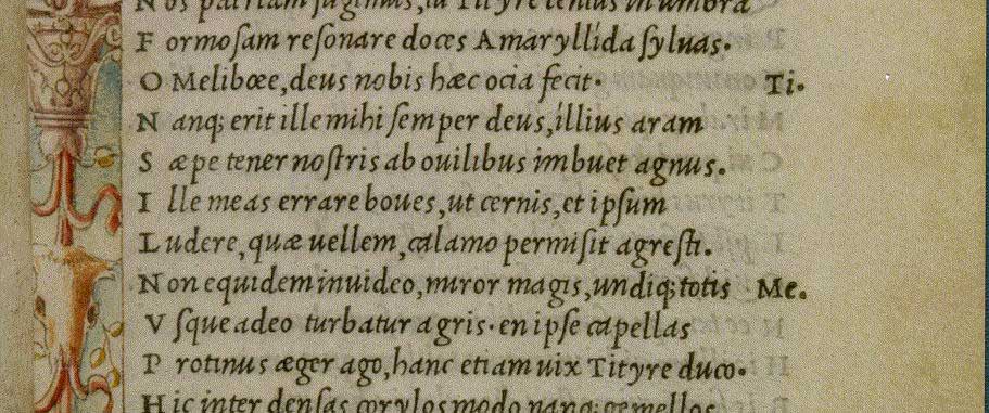
Whenever we think about the invention of the italic typeface we invariably think of the year 1501, when the italic type, commissioned by Aldus Manutius and cut by Griffo, was employed to set a new series of small pocket books, first published in 1501.
Aldus, writing to his friend, the eminent Italian scholar, Scipio Carteromachus:
“We have printed, and are now publishing, the Satires of Juvenal and Persius in a very small format, so that they may more conveniently be held in the hand and learned by heart (not to speak of being read) by everyone.”
However, the Aldine Italic type does make an appearance — albeit a very brief one — in a much larger folio edition of 1500: The Epistole of St. Catherine of Siena (ISTC: ic00281000), set within a beautiful woodcut illustration (not so the feet) of St. Catherine herself. The italic appears printed across the open book and heart in either hand. Interestingly, the book was commissioned by Margherita Ugelheimer, widow of Peter Ugelheimer, former business partner and close friend to Nicholas Jenson.
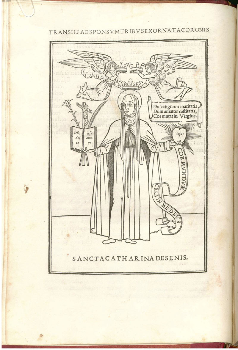

And, no, I don’t know why those two angels are holding three crowns above St. Catherine’s head. I guess it symbolizes either the Trinity or, as in the case of the three crowns on the Pope’s Tiara or triregnum, the threefold power of the pontiff. Or, it might symbolize the three virtues written across the scroll (above the heart): Dulce signum charitatis. / Castitatis, / Cor mutat in Virgine. (charity, chastity, and something about the heart of the Virgin (Mary).
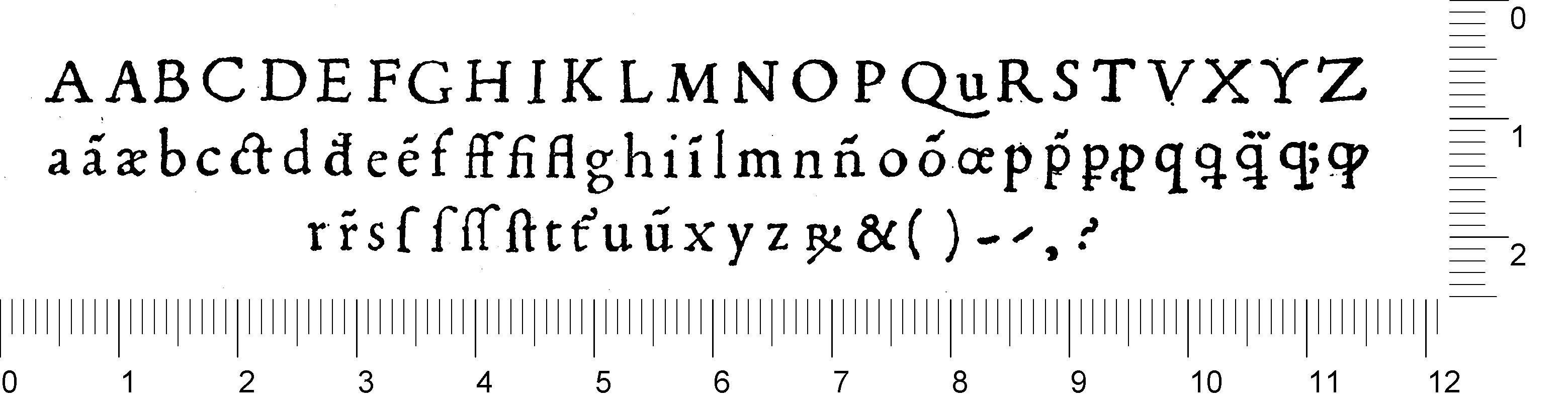
And if you were wondering how small Aldus’s octavo editions were, then here you go: